Design Poster
Hello everyon, welcome to my website!
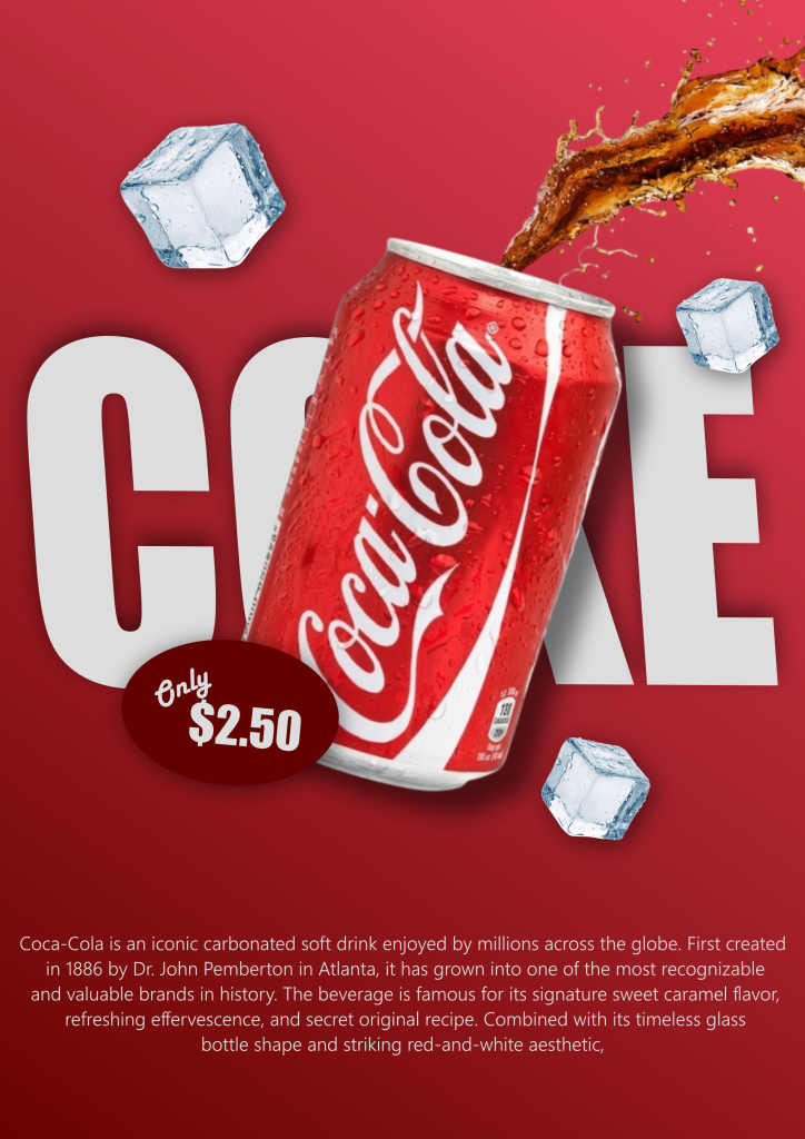
The first thing I did was prepare the materials that I needed for the poster. I searched for pictures of Coca-Cola bottles and other elements that could make the poster look better. I also looked for inspiration from other advertisements and posters. By looking at different examples, I could understand how to arrange the pictures, text, and other elements properly. However, I did not simply copy the designs. I tried to create my own version based on the ideas that I got from the references.
After preparing the materials, I started creating the main layout of the poster. I placed the Coca-Cola bottle as the main object because I wanted people to immediately know what product I was promoting. Then, I added the Coca-Cola logo and some promotional text. I made sure that the important information was easy to see. I also tried different positions and sizes for the text until I found a layout that looked good.
One of the most important parts of this project was choosing the right font. I wanted the text to be easy to read but still fit the style of the poster. I experimented with several fonts and sizes before choosing the ones that looked the best. I also learned that the position of text is important because a poster should not have too much empty space or too many elements in one area.
During the design process, I faced some difficulties. One of the problems was arranging all the elements so that the poster did not look too crowded. At first, I put too many elements on the poster, which made it difficult to focus on the main product. I then removed some unnecessary elements and changed the positions of the others. After making several changes, the design became cleaner and easier to understand.
Another challenge was making the product look attractive. I tried to adjust the size, position, and effects of the Coca-Cola bottle so it could become the main focus of the poster. I also added some visual effects to make the product stand out. I learned that small details can make a big difference in graphic design.
This project also taught me the importance of patience. A good design cannot always be finished in one try. I had to make several revisions before I was satisfied with the final result. Sometimes I had to change the colors, move the pictures, adjust the text, or remove some elements. Even though it took time, I enjoyed the process because I could see my poster improve step by step.
From this second multimedia project at IDN, I learned many new things about graphic design and advertising. I learned how to choose colors, arrange elements, select fonts, and create a visual concept. I also learned how important creativity and attention to detail are when making a poster.
Overall, I am happy with my second project because I was able to create a Coca-Cola promotional poster using my own ideas and creativity. This project was a good experience for me because it helped me improve my multimedia skills. I hope that in my next projects, I can create designs that are even more creative, professional, and attractive.